Bonsai, the name of Nutrien Ag Solutions Design System, stands as a testament to the robustness
and scalability of our creation. From its foundation in simple atoms to the vast expanse of templates
and pages, Bonsai empowers our design endeavors, ensuring consistency and efficiency across
our projects.

Design Roles
UX Design
Visual Design
Brand Consistency
Architecture
Vision Planning
Management
Activities
User Surveys
User Testing
UX/UI Design
Documentation
Prototypes
Specifications for Engineering
Design Direction
Evangelism/Socialization
Specifications
Duration
Continuing
Tools & Software
Figma
Team Size
6 Engineers
1 Product Manager
1 UX Researcher
3 UX Designers
1 Sr. Principle Design Lead
(that’s me!)
Why is Nutrien creating a Digital Hub?

The digital evolution of agriculture is here. Nutrien Ag Solutions is at the forefront of precision agriculture.

Dominant Use Case:
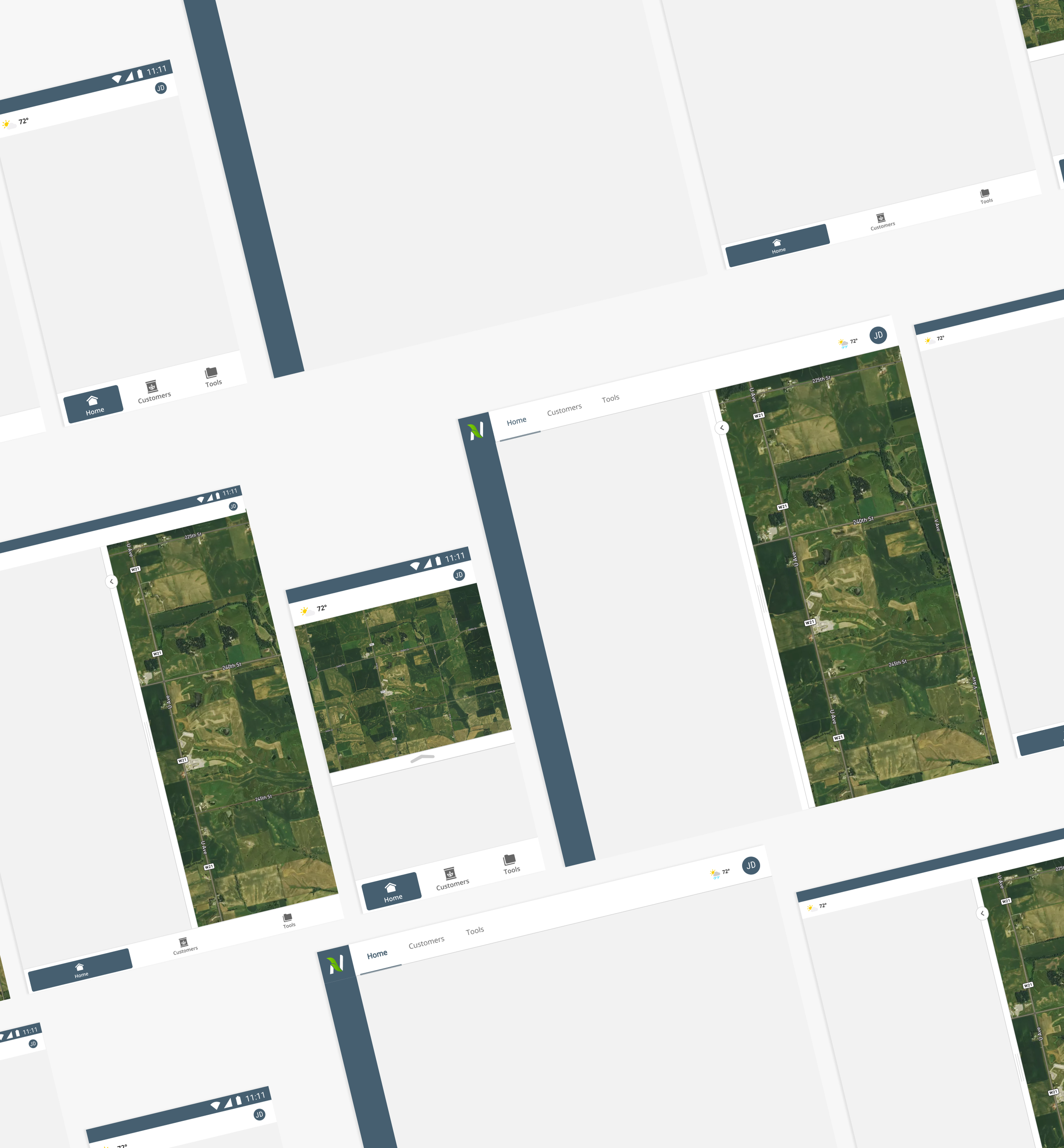
Customers (Growers) and Sales people (Crop Consultants) frequently find themselves in the field, and when it comes to their go-to device, a tablet is often the preferred choice. Its portability and versatility make it the perfect tool for staying connected and productive while on the move.
The challenge
Initially, Nutrien began with a small design system based on Material UI, but it lacked a cohesive strategy due to limited collaborative efforts. However, in 2020, we recognized the importance of learning from our past mistakes. We embarked on a journey to develop a connected design system that could serve as a single source of truth for designers and developers.
Our primary objective was to address the challenge of developers not having a centralized resource for essential onboarding on grids, spacing, and general components. Additionally, designers faced difficulties in maintaining consistency across various functions, such as date selection or displaying errors within the app.
These limitations were felt throughout the entire organization, hindering our ability to scale and iterate effectively. By establishing a comprehensive and connected design system, we aimed to overcome these challenges, fostering a more efficient and harmonious collaboration between design and development teams and enabling smoother scalability and innovation across the organization.
The Opportunities
Socialize and commit to a component-driven design and development process.
Adopt an Atomic methodology for designing and developing components.
Ensure our design and coded components are linked to their corresponding single sources of truth.
Provide product teams in US, Canada, Brazil, and Australia with visibility into the building blocks that form the product through a comprehensive documentation website.
Create significant template components to expedite feature development for developers.
Establish consistency across Nutrien's app to reduce cognitive load on the user.
Bonus: Elevate the organization’s UX design maturity and raise awareness of UX design by implementing a centralized design system website.
Nutrien Sells seed, Crop protection, Nutrients
$24.5 Billion Worth in 2021
By providing tailored Crop consultants, precision ag services, & digital tools for analysis
Serving 500,000+ Farmers in 2021
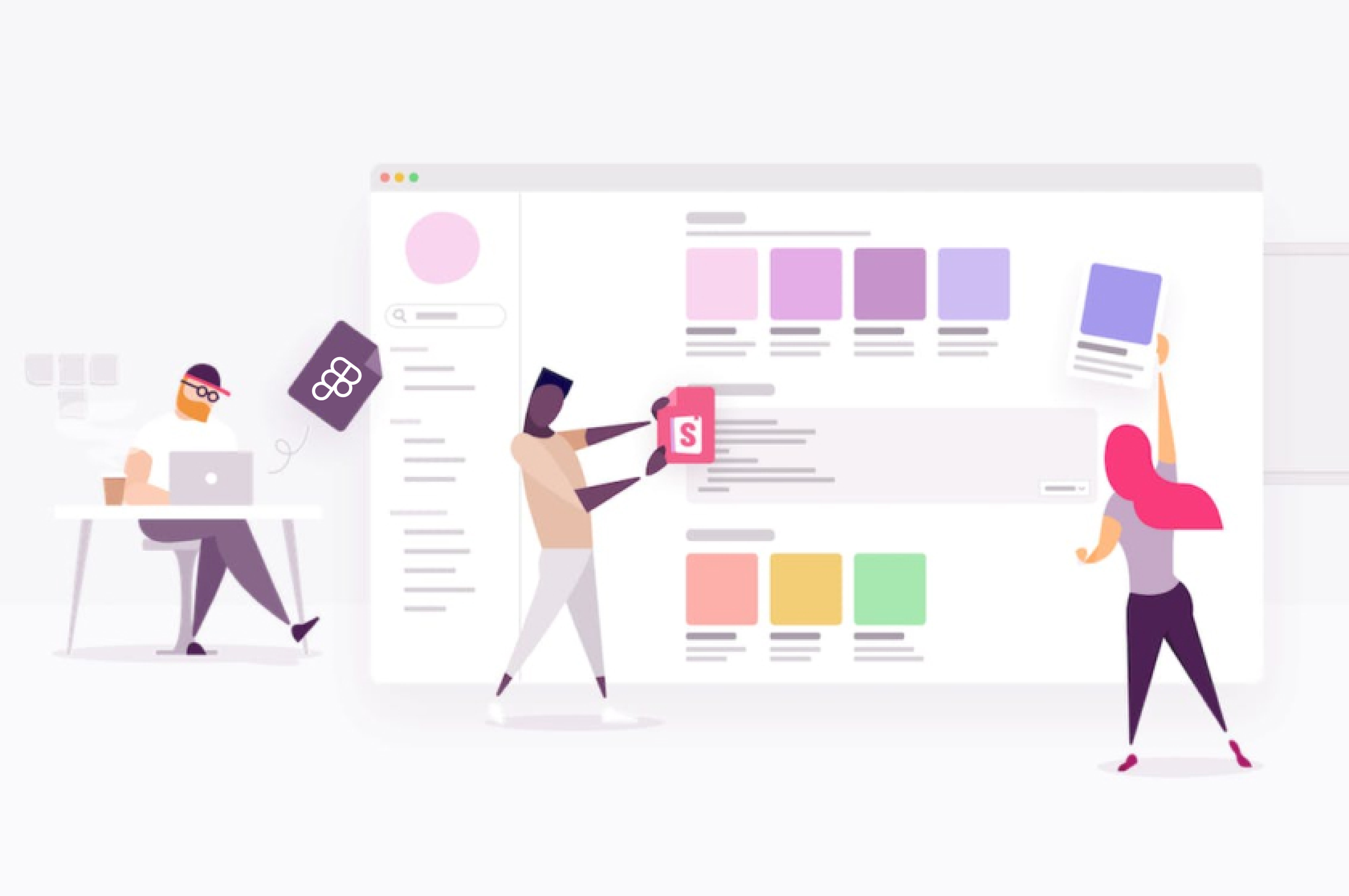
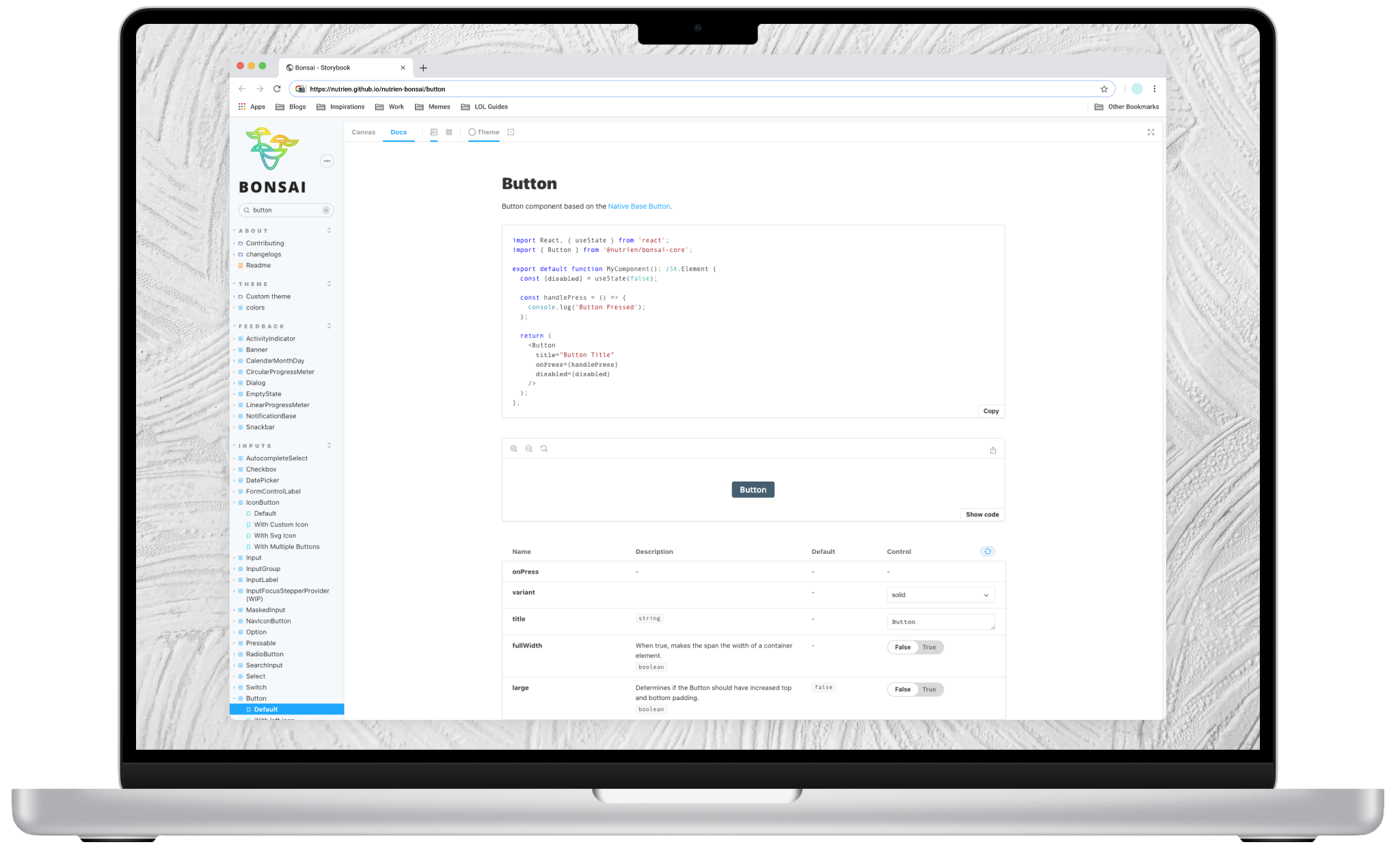
A Single Source of Truth
Nutrien's product, the Nutrien Hub, constantly matures to cater to the ever-evolving needs of growers and crop consultants. To facilitate this growth, the Bonsai design system emerges as a vital asset, managing the creative and development process at scale.
Bonsai comprises three key elements, each contributing to the system's efficacy:
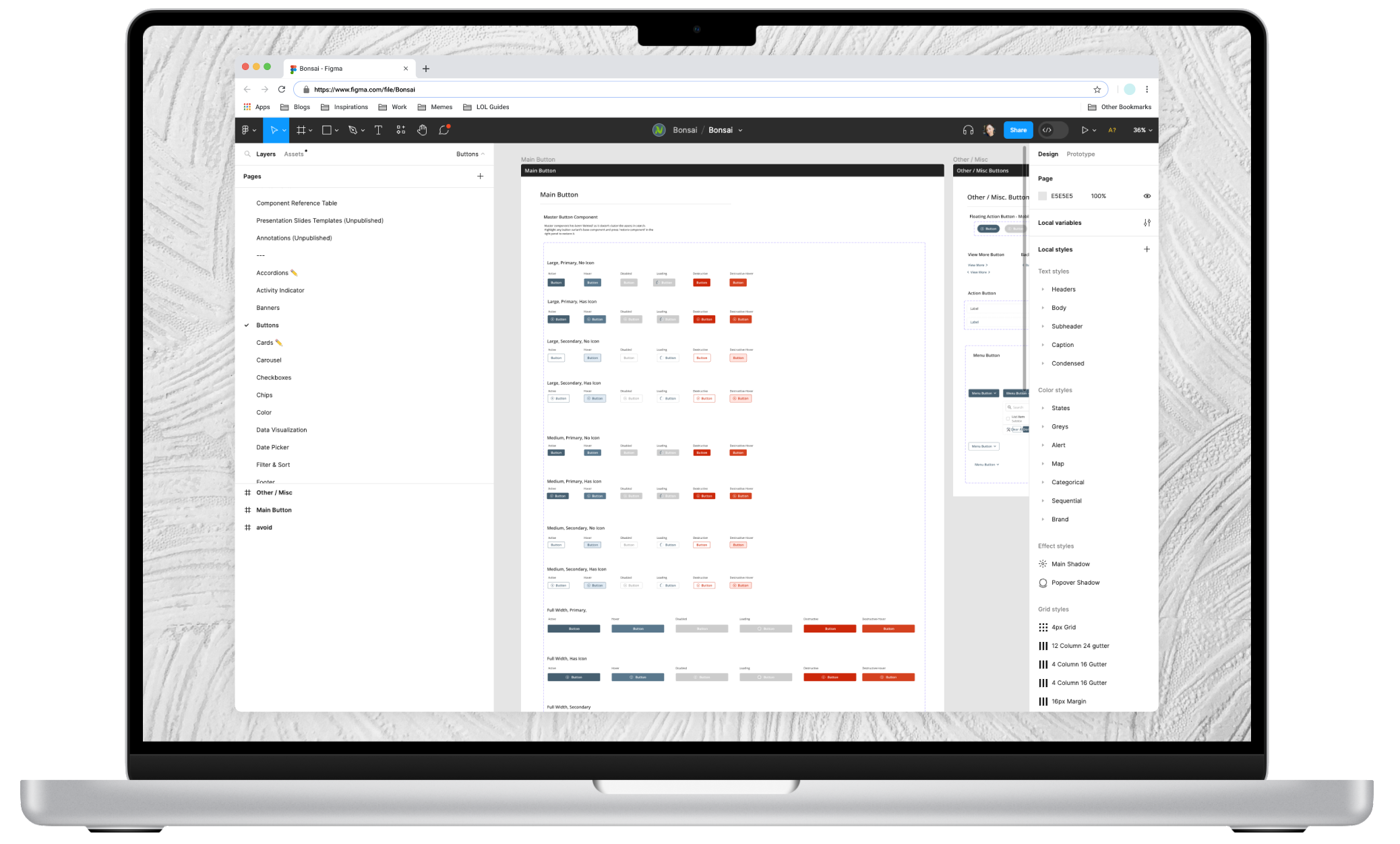
Bonsai UI Kit: This encompasses components meticulously designed and managed in Figma.
Bonsai Code Kit: These are functional components that mirror the Figma designs. Nutrien employs StorybookJS to host and organize them.
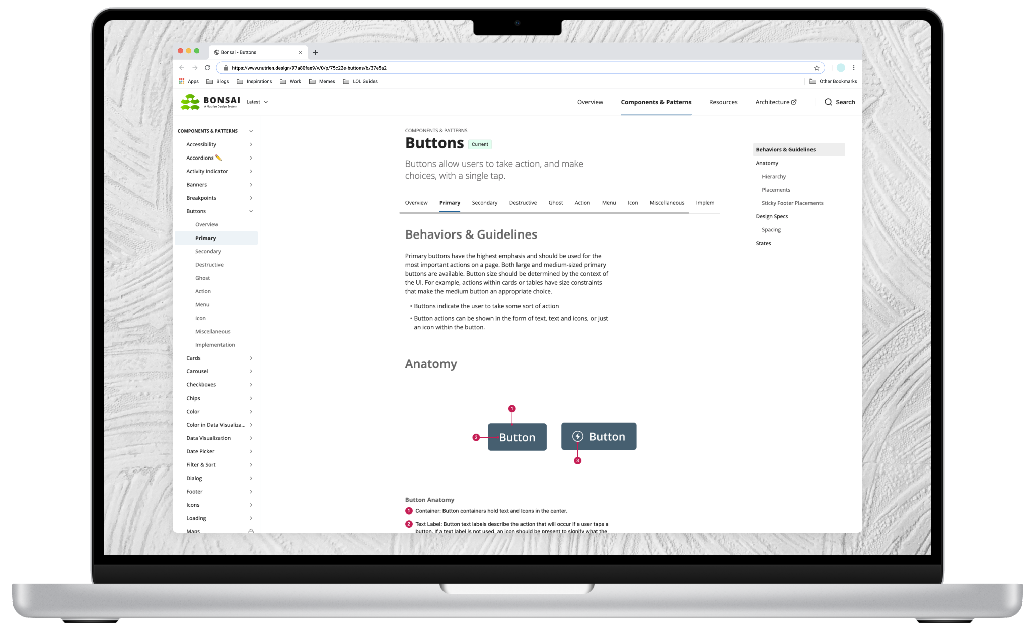
The Documentation Website: The central hub, this website acts as a one-stop-shop for comprehensive documentation on how, when, and where to utilize atoms, patterns, and templates. By utilizing Zeroheight, Nutrien collaboratively builds a unified single source of truth with developers.
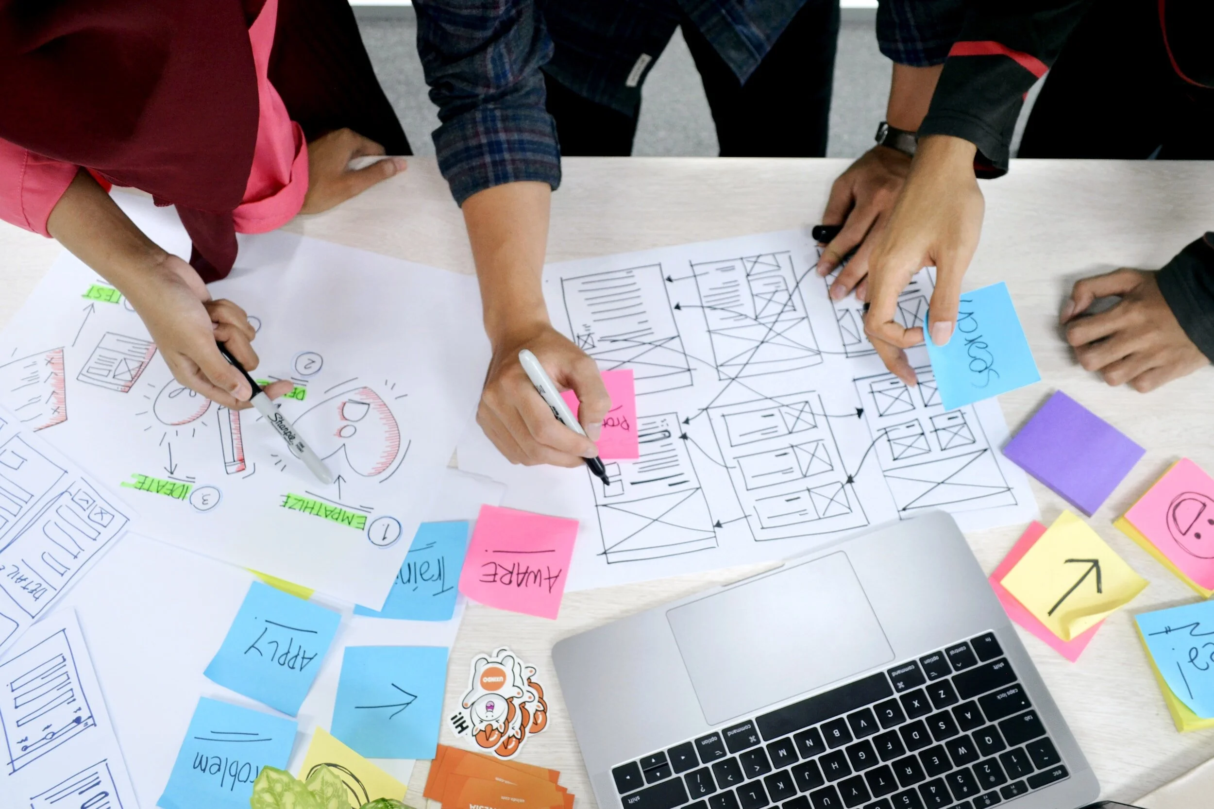
The Process
To create a cohesive system, the two camps - design and development - worked together closely, with design informing development and vice versa.
During this process, an opportunity arose to modernize our tools and streamline our workflows. The design team consolidated their design stack, transitioning from multiple tools to a single comprehensive solution: Figma. Figma now handles collaboration, design, prototyping, file management, and version control, simplifying the design process and promoting efficient teamwork.
Simultaneously, the development team boldly and strategically decided to move away from three separate codebases to a unified one: React Native. By adopting React Native, development becomes more versatile, as the codebase can be used across iOS, Android, and desktop platforms.

Research
Scoping:
We initiated the process by communicating the value and mission of our design system to stakeholders, emphasizing its significance to the organization's goals. Simultaneously, we collaborated closely with product management and development leadership to determine the requirements for establishing a dedicated design system team. This team would consist of developers, designers, and product management experts. Our efforts culminated in presenting our findings to upper management, gaining their valuable support.
Discovery:
To ensure a user-centric design system, we conducted thorough research to understand the needs of potential users who would interact with the system. This phase involved user interviews and journey mapping, providing critical insights into user preferences and requirements. A significant discovery was the importance of a close relationship between designed components and their corresponding coded counterparts.
Competitive Analysis:
To identify features that addressed our specific needs, we comprehensively analyzed existing design systems, comparing their similarities and differences. We also evaluated the cost benefits of DS tools such as Pattern Lab and Bit. By carefully assimilating the best ideas from various sources, we created a design system tailored to our unique requirements and challenges.
Adopting an Atomic approach to component design and development
Atomic design, introduced by Brad Frost in 2013, is a methodology for creating design systems. It draws an analogy from our physical world's atomic system, where units combine to form molecules and organisms. Similarly, we start with fundamental building blocks in digital products and progressively organize them for a cohesive user experience.
“Atomic design is not a linear process, but rather a mental model to help us think of our user interfaces as both a cohesive whole and a collection of parts at the same time.”
– Brad Frost
Atoms
Icons
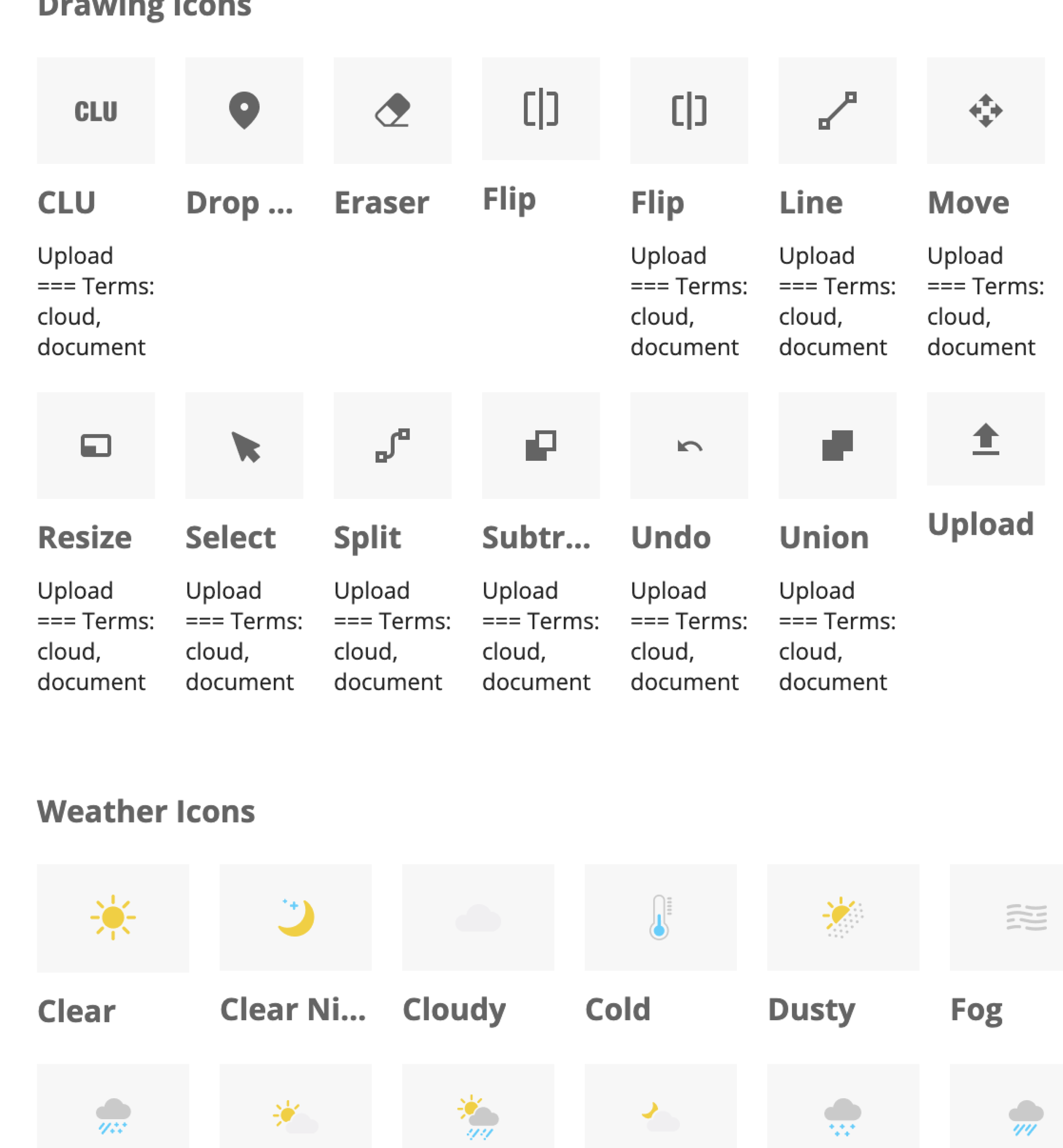
Typography

Colors
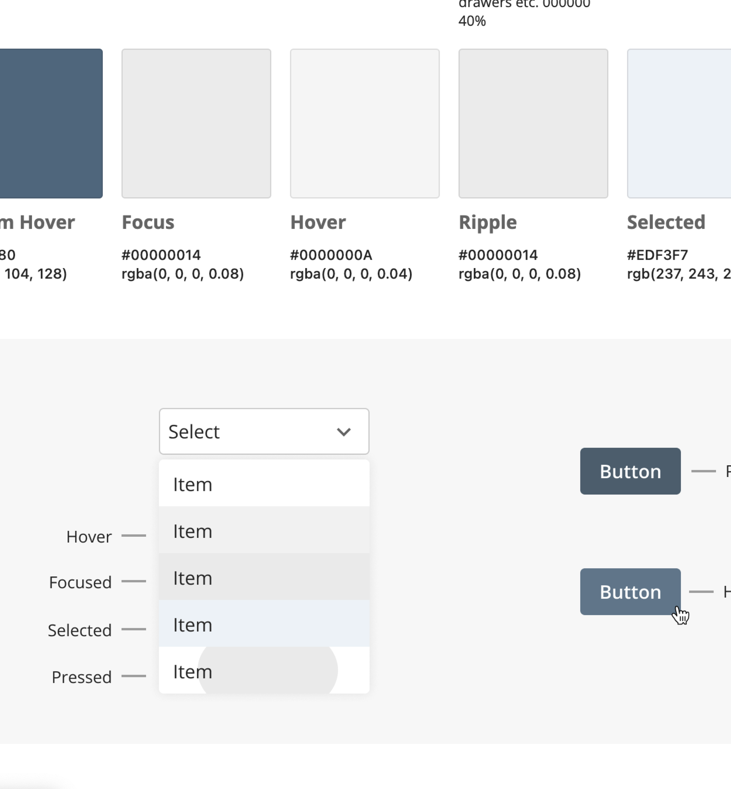
Molecules
Buttons, Chips, Snackbars, Etc.
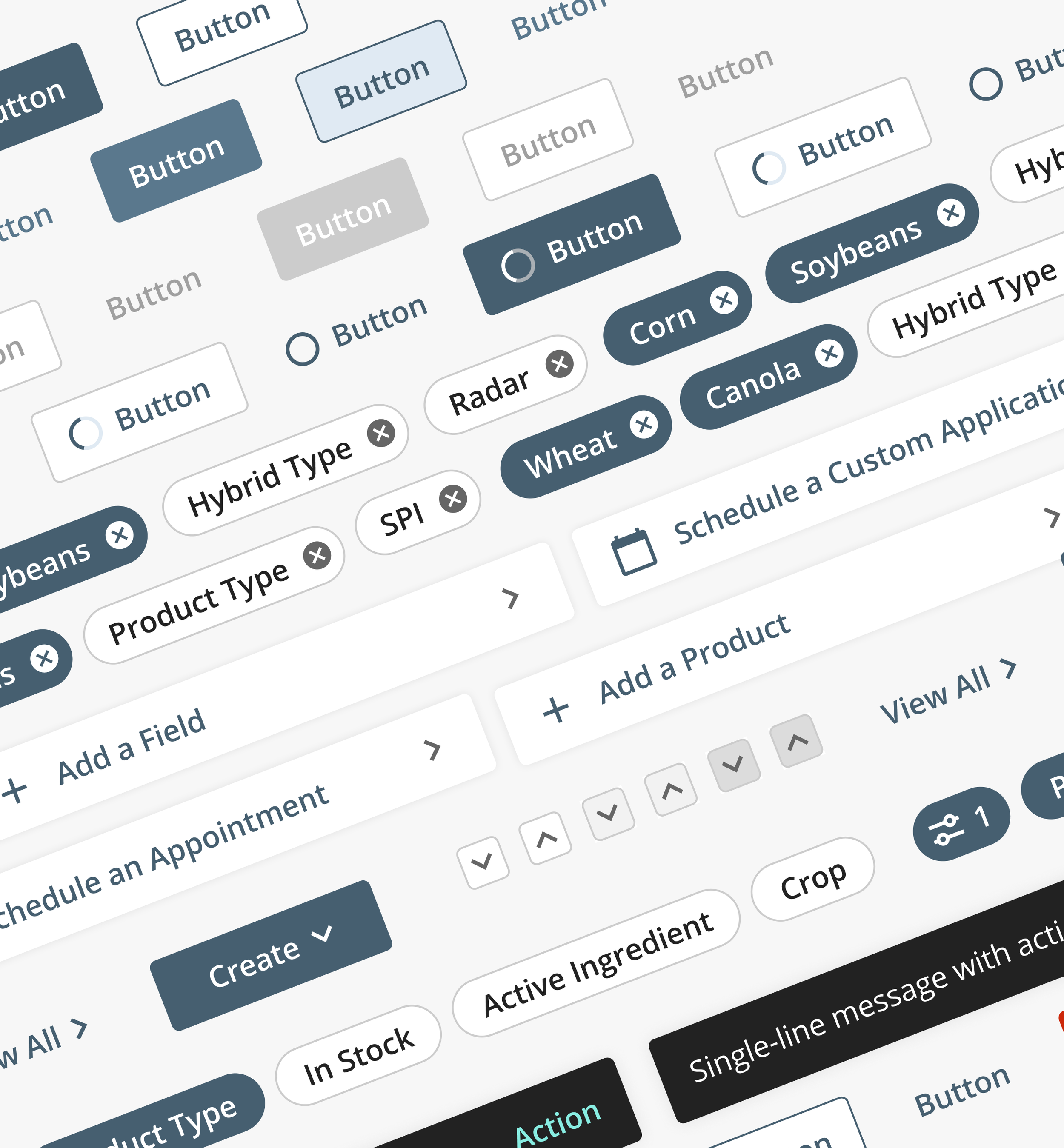
Organisms
Inputs, Select Menus, Cards, Etc.

Templates
Next Steps:
The design system team surveyed to gauge opportunities for improvement. Here are the key takeaways:

Synthesis of Design System Survey
In our research synthesis process, we employ various methods, and for this particular case, we utilized a prioritization matrix to analyze the feedback. This approach allowed us to track requests for additional documentation while gauging the effort required to enhance specific components. Using the prioritization matrix, we effectively managed and prioritized our actions, ensuring that our design system addresses the most important user needs and streamlining the effort required for implementation.
Documentation
Our current objective is to document 80% of the design system, while the remaining 20% is still undergoing continuous updates and refinement. The 80/20 rule strikes a good balance in terms of focus and allocation of resources.
Documentation holds significant importance, as it enables designers, product managers, and engineers to grasp the system's functionality and use it efficiently. By providing clear and comprehensive documentation, we empower our teams to work seamlessly with the design system, fostering a streamlined and productive development process.
OTHER PROJECTS