Nutrien is a Canadian fertilizer company breaking into the digital world by creating an app recommending the best products for customers worldwide.
Design Roles
UX Design
Visual Design
Brand Consistency
Architecture
Vision Planning
Design Deliverables
User Surveys
User Interviews
User Stories
User Flows
Wire-Frames
User Testing
UX/UI Design
Specifications for Engineering
App Icon
App Store Imagery
Specifications
Duration
18 months
Tools & Software
Figma
Adobe Illustrator
Team Size
7 squads of 5 engineers
6 Product Manager
4 UX Researcher
8 UX Designers
1 UX Design Lead (that’s me!)
-
Description teNutrien Ag Solutions is a retail agricultural input and service provider. It is a subsidiary of Nutrien Ltd., a Canadian fertilizer company formed in 2018 by the merger of Potash Corporation of Saskatchewan and Agrium. Nutrien Ag Solutions offers a range of products and services to help growers improve their crop yields, including fertilizers, crop protection chemicals, seed, and agronomic advice. The company operates in 14 countries and has more than 2,000 retail locations worldwide.xt goes here
The challenge
In 2019, Nutrien launched a digital e-commerce platform for customers to pay bills and purchase products. The initial desktop-centric e-commerce experience for customers was not seen as valuable then. However, it became evident that our customers highly value our employees' personalized service and agronomic expertise.
The solution
Recognizing the need to rectify this oversight, we embarked on a redesign journey focused on improving customer and employee experiences. Our guiding concept was clear: "The customer app must make the employee's life easier." By prioritizing enhancing employee workflows, we aimed to create an app that would become indispensable for customers.
Through this strategic redesign, we aimed to create a seamless connection between our employees and customers, leveraging technology to simplify and enhance their interactions. The redesigned app would serve as a user-friendly and efficient platform, empowering customers while fostering a stronger partnership between Nutrien and its customers.
Our ultimate goal was to integrate cutting-edge technology with human expertise, providing the best of both worlds and delivering a superior experience that meets the unique needs of customers.
Project Goals
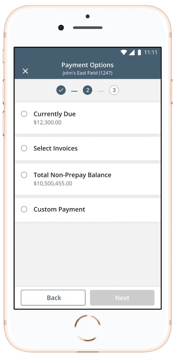
Design a workflow-based platform for a seamless and intuitive user experience, focusing on simplicity and logical flow.
Cater to 30-45-year-old and 50-80-year-old audiences by providing a mobile experience for on-the-go users.
Enhance UI consistency across the app by implementing a user-friendly, widely shared design system for designers and engineers to leverage.
To improve accessibility, we replaced the current primary color with an approved marketing color that is accessible to all users, including those with color blindness. Given that a significant portion of our user base identifies as male and experiences some color blindness, this change will ensure a more inclusive user experience for everyone.
To achieve our goals, we will adopt a workflow-based design approach that simplifies user interactions, reduces confusion, and improves overall usability. Additionally, we'll ensure the platform accommodates the preferences of both tech-savvy and mature audiences through mobile accessibility.
By successfully implementing these project goals, we'll create an inclusive and user-friendly e-commerce platform that aligns with employee workflows, enhances the customer experience, and caters to the diverse needs of our customer base.
Project
Product Catalog
The product catalog was limited to a single location, despite our users adding products from various sources. This resulted in a cumbersome experience, described by one user as "searching through boxes" rather than seamlessly finding what they needed. Additionally, the mobile version of the catalog made it challenging to view multiple products simultaneously.
To improve this, we focused on enhancing the accessibility and flow of the product catalog. Users now effortlessly find the products they need by integrating multiple starting points and offering a cohesive experience. Furthermore, we optimized the mobile version to allow for better visibility and the ability to view more products at once. These improvements significantly enhanced the user experience and streamlined product discovery.


Navigation
Initially, Nutrien's navigation system posed challenges for employees as it was structured around individual features rather than intuitive workflows. The secondary navigation felt disjointed, serving as a temporary solution for features without a proper place. Mobile navigation further compounded the issue by utilizing a "hamburger" menu, causing friction for users.
Our redesign aimed to simplify the navigation, ensuring it remains easily accessible and user-friendly. Instead of pushing options far from the most convenient touchable areas on a phone, we kept the navigation at the bottom of the screen. This approach allows for a more natural and efficient interaction by keeping essential options within easy reach.
We sought to create a seamless user experience that aligns with intuitive workflows by re-evaluating and optimizing the navigation system. Our goal was to eliminate confusion, improve efficiency, and enhance the overall navigation usability, making it effortless for users to navigate through the app.


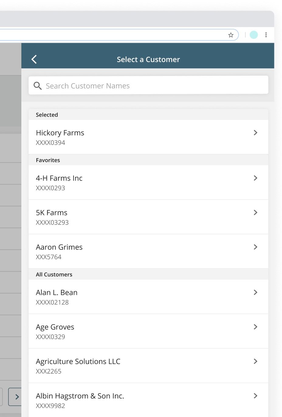
Customer and Geospatial Selection
Nutrien faces a unique challenge where customer financial accounts are associated with their farms and fields rather than directly linked without a hierarchy. Consequently, every part of the app needs to identify the selected account to retrieve the relevant information on the page. Unfortunately, the UX team discovered this requirement late in the original design process. Our app redesign prioritized addressing this issue and improving the interaction to feel seamlessly integrated.

Weather & Markets
Nutrien encountered challenges integrating weather and market data from the third-party provider, DTN. Nutrien strategically decided to develop its own weather service in the app redesign to address these difficulties. Their weather service incorporates advanced models and observations, including the state-of-the-art European Model, the USA Doppler radar network, and the National Weather Service. Leveraging their weather team's expertise and experience in atmospheric sciences, they now deliver real-time and agronomically relevant weather insights.
By creating their own weather service, the UX team gained the opportunity to design a user interface that precisely caters to Nutrien's users' needs and preferences rather than inheriting a third-party UI. This shift enabled the team to provide a seamless and customized weather experience within the app, equipping agronomy professionals with valuable information for informed decision-making.


Odds and Ends
During this endeavor, we identified a few areas for improvement, such as Filters, Margins, and utilizing more crop and product type icons. Nutrien's existing use of filters was found to need to be confusing and disjointed. Additionally, the margins in the app presented issues specifically on phone sizes ranging from 320 to 375 pixels. Furthermore, user feedback indicated that our app appeared visually monotonous due to extensive text content. We needed to address these smaller yet significant pieces of feedback during this phase of redesign.


Custom Icons
I collaborated with an illustrator to create standout icons for our app, setting it apart from other agriculture apps. When customers search for the Hub, our unique icon catches their attention and leaves a lasting impression. We also created new product types, crops, and empty state icons.


Takeaways
Our team successfully simplified the app while considering the user's goals. Throughout the process, we embraced Antoine de Saint-Exupery's quote, "A designer knows [they have] achieved perfection not when there is nothing left to add, but when there is nothing left to take away." This project truly exemplified the essence of this quote. It taught me the importance of finding the simplest and most effective design solution, even if it appears complete. This principle now guides all of my work.
Outcomes
Nutrien's digital users initially expressed frustration with the features we were releasing and doubted our ability to meet the set deadlines for the app. They needed help understanding the decision to rebuild everything we had already created, and corporate's patience wore thin regarding the funding allocated to the project. However, following the release of the app, their perspective has shifted. They now recognize its significant improvements to their workflow and overall job performance. This has helped rebuild trust in the digital transformation project and provided us additional time to deliver more features that enhance their experience. A crucial factor in building this trust was the creation of a prototype, which I offered to create. This prototype served as a visual representation for the business, helping them understand the scope of the rebuild and why it required considerable time.
OTHER PROJECTS